Plotting Data#
import matplotlib.pyplot as plt
from magentropy import MagentroData

magdata = MagentroData('magdata.dat')
magdata.process_data()
Show code cell output
"[Data]" tag detected, assuming QD .dat file.
The sample mass was determined from the QD .dat file: 0.1
The data contains the following 5 magnetic field strengths and observations per field:
20.0     100
40.0     100
60.0     100
80.0     100
100.0    100
Name: T, dtype: int64

Processing data using the following settings:
{
	npoints: 1000,
	temp_range: [-inf  inf],
	fields: [],
	decimals: 5,
	max_diff: inf,
	min_sweep_len: 10,
	d_order: 2,
	lmbds: [nan],
	lmbd_guess: 0.0001,
	weight_err: True,
	match_err: False,
	min_kwargs: {'method': 'Nelder-Mead', 'bounds': ((-inf, inf),), 'options': {'maxfev': 50, 'xatol': 0.01, 'fatol': 1e-06}},
	add_zeros: False
}

scipy.optimize.minimize: Optimization terminated successfully.
Processed M(T) at field: 20.0
scipy.optimize.minimize: Optimization terminated successfully.
Processed M(T) at field: 40.0
scipy.optimize.minimize: Optimization terminated successfully.
Processed M(T) at field: 60.0
scipy.optimize.minimize: Optimization terminated successfully.
Processed M(T) at field: 80.0
scipy.optimize.minimize: Optimization terminated successfully.
Processed M(T) at field: 100.0
Calculated raw derivative and entropy.

last_presets set to:
{
	npoints: 1000,
	temp_range: [  0.99999934 100.00000083],
	fields: [ 20.  40.  60.  80. 100.],
	decimals: 5,
	max_diff: inf,
	min_sweep_len: 10,
	d_order: 2,
	lmbds: [0.00091728 0.00054639 0.00072862 0.00091728 0.00095775],
	lmbd_guess: 0.0001,
	weight_err: True,
	match_err: False,
	min_kwargs: {'method': 'Nelder-Mead', 'bounds': ((-inf, inf),), 'options': {'maxfev': 50, 'xatol': 0.01, 'fatol': 1e-06}},
	add_zeros: False
}

Finished.
Data may be plotted as lines using plot_lines() or as a map using plot_map().
In each, the property may be specified by the data_prop parameter, which can take
values 'M_per_mass', 'M_per_mass_err', 'dM_dT', or 'Delta_SM', corresponding
to the moment per mass, moment per mass error, derivative with respect to temperature,
and entropy, respectively. The data version is specified by the data_version parameter,
which can take values 'raw', 'converted', or 'processed'. Line plots can also
include converted and processed data together if data_version = 'compare'.
Both methods accept an optional ax argument specifying the Axes to use, as well as optional
T_range and H_range arguments limiting the temperature and magenetic field range, respectively.
Important
All plotting parameters referring to physical quantities, such as T_range, H_range,
and offset, are expected to be in the units indicated by data_version.
Lines#
By default, line plots group data by magnetic field using the settings in last_presets.
The data is grouped by temperature if at_temps, a list of temperatures, is supplied.
A legend can be added with legend = True (default False).
fig, ax = plt.subplots(1, 2, figsize=(10, 5), sharey=True)

magdata.plot_lines(data_prop='Delta_SM', data_version='processed', ax=ax[0], legend=True)

magdata.plot_lines(
    data_prop='Delta_SM', data_version='processed', ax=ax[1],
    at_temps=[20, 40, 60, 80], legend=True
)

ax[1].set_ylabel('')
fig.tight_layout();

Setting data_version = 'compare' plots both the converted and processed data as dots and lines, respectively:
fig, ax = plt.subplots(figsize=(6, 4))
magdata.plot_lines(data_prop='dM_dT', data_version='compare', ax=ax);

An offset can be added to better view the shapes of individual lines, though this must be
taken into account when reading off the vertical axis.
A discrete Colorbar can be added with colorbar = True.
fig, ax = plt.subplots(figsize=(8, 4))
magdata.plot_lines(data_prop='dM_dT', data_version='processed', ax=ax, offset=0.8, colorbar=True);

Adding a Colorbar is easiest for individual plots. Some extra work is required when adding
Colorbars to Figures with multiple Axes.
fig, ax = plt.subplots(1, 2, figsize=(12, 5), sharey=True)

magdata.plot_lines(
    data_prop='Delta_SM', data_version='processed', ax=ax[0],
    colorbar=True, colorbar_kwargs={'ax': ax[0], 'fraction': 0.07, 'pad': 0.05}
)

magdata.plot_lines(
    data_prop='Delta_SM', data_version='processed', ax=ax[1], at_temps=[20, 40, 60, 80],
    colorbar=True, colorbar_kwargs={'ax': ax[1], 'fraction': 0.07, 'pad': 0.05}
)

ax[1].set_ylabel('');

Note the use of colorbar_kwargs to pass keyword arguments directly to Figure.colorbar().
Similarly, plot_kwargs can pass keyword arguments to Axes.plot(). It can be either a
single dictionary or a list of dictionaries corresponding to the lines.
fig, ax = plt.subplots(figsize=(6, 4))

magdata.plot_lines(
    data_prop='dM_dT', data_version='processed', ax=ax,
    plot_kwargs=[
        {'linewidth': 2},
        {'linestyle': '--'},
        {'linestyle': '', 'markersize': 0.1, 'marker': '.'},
        {'color': 'red'},
        {}
    ]
);

See plot_lines() for full documentation.
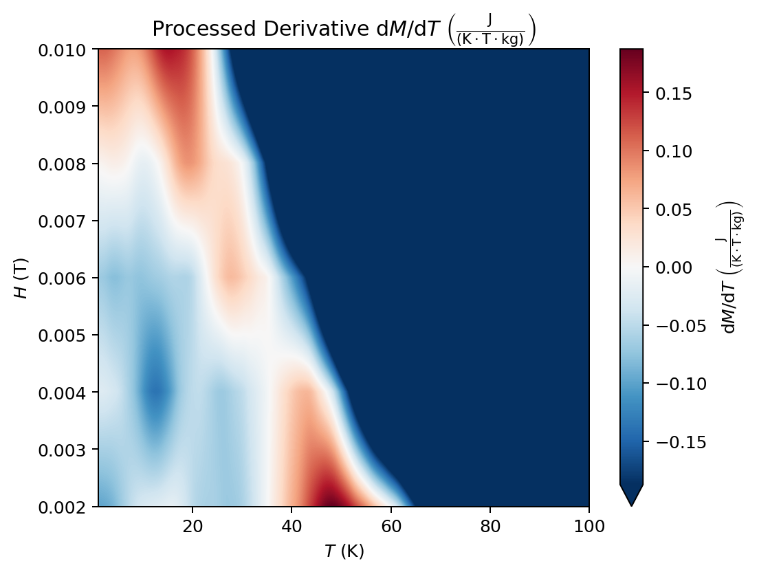
Maps#
The method plot_map() creates a heat map with temperature on the horizontal axis,
magnetic field strength on the vertical axis, and data_prop as the color.
By default, colorbar is True for maps.
fig, ax = plt.subplots(figsize=(6, 4))
magdata.plot_map(data_prop='dM_dT', data_version='processed', ax=ax);

Notice that the color range is automatically centered around zero, clipping extreme values,
as indicated by the arrow at the bottom of the Colorbar. This is useful in many cases;
however, if this behavior is not desired, one can explicitly pass center = False to the method.
fig, ax = plt.subplots(figsize=(6, 4))
magdata.plot_map(data_prop='dM_dT', data_version='processed', ax=ax, center=False);

When the colors are not centered around zero, the cmap is changed to one that is sequential,
rather than diverging. Keyword arguments such as cmap can be passed to Axes.imshow()
via imshow_kwargs:
fig, ax = plt.subplots(figsize=(6, 4))

magdata.plot_map(
    data_prop='dM_dT', data_version='processed', ax=ax,
    center=False, imshow_kwargs={'cmap': 'jet'}
);

Contours can also be added with contour = True
and customized with contour_kwargs, passed to Axes.contour().
fig, ax = plt.subplots(figsize=(6, 4))

magdata.plot_map(
    data_prop='dM_dT', data_version='processed', ax=ax, center=False,
    contour=True, contour_kwargs={'linewidths': 1.0}
);

The grids used to construct the maps are available directly using get_map_grid().
For example,
T_grid, H_grid, Delta_SM_grid = magdata.get_map_grid(data_prop='Delta_SM', data_version='processed')
Delta_SM_grid[:3, :3]
array([[-9.82653799e-05, -9.82399942e-05, -9.82019155e-05],
       [-9.87532011e-05, -9.87277929e-05, -9.86896804e-05],
       [-9.92410224e-05, -9.92155916e-05, -9.91774454e-05]])
T_grid[:3, :3]
array([[0.99999934, 1.09909844, 1.19819754],
       [0.99999934, 1.09909844, 1.19819754],
       [0.99999934, 1.09909844, 1.19819754]])
H_grid[:3, :3]
array([[0.002     , 0.002     , 0.002     ],
       [0.00200801, 0.00200801, 0.00200801],
       [0.00201602, 0.00201602, 0.00201602]])
By default, linear interpolation is used to create the grids. It is recommended to at least start
with linear interpolation, as cubic interpolation can occasionally result in artifacts.
The interpolation method, passed to scipy.interpolate.griddata()’s method parameter,
can be specified in get_map_grid() or in plot_map() with interp_method:
fig, ax = plt.subplots(1, 2, figsize=(12, 5), sharey=True)

magdata.plot_map(
    data_prop='Delta_SM', data_version='processed', ax=ax[0],
    colorbar=False,
    interp_method='linear'
)

magdata.plot_map(
    data_prop='Delta_SM', data_version='processed', ax=ax[1],
    colorbar_kwargs={'ax': ax, 'fraction': 0.1, 'pad': 0.05},
    interp_method='cubic'
)

ax[0].set_title('Linear interpolation')
ax[1].set_title('Cubic interpolation')
ax[1].set_ylabel('');

We can see that cubic interpolation produces a smoother result than linear interpolation, with no noticeable artifacts in this case.
Previously-processed data#
It is possible to plot previously-processed data contained in DataFrames using the class
methods plot_processed_lines() and plot_processed_map(). This allows one to avoid having
to re-process data. As an example, we’ll use the processed data from above.
processed_df = magdata.processed_df

fig, ax = plt.subplots(1, 2, figsize=(12, 5))

MagentroData.plot_processed_lines(processed_df, data_prop='M_per_mass', ax=ax[0], legend=True)

MagentroData.plot_processed_map(
    processed_df, data_prop='M_per_mass', ax=ax[1],
    colorbar_kwargs={'ax': ax, 'fraction': 0.05, 'pad': 0.01}
);

In plot_processed_lines(), a compare_df can also be supplied for comparison plots.
converted_df = magdata.converted_df

fig, ax = plt.subplots(figsize=(6, 4))

MagentroData.plot_processed_lines(
    processed_df, compare_df=converted_df,
    data_prop='M_per_mass', ax=ax, legend=True
);

With the exception of data_version, the rest of the parameters for plot_lines() and
plot_map() are also available for these two methods.
Convenience methods#
Three convenience plotting methods are available.
plot() passes keyword arguments to plot_lines() or plot_map() depending on whether
plot_type is 'lines' or 'map'.
fig, ax = plt.subplots(figsize=(6, 4))

magdata.plot(
    plot_type='lines', data_prop='dM_dT', data_version='converted',
    ax=ax, at_temps=[20, 40, 60, 80], colorbar=True
);

Similarly, plot_processed() passes keyword arguments to plot_processed_lines() or
plot_processed_map().
fig, ax = plt.subplots(figsize=(6, 4))

MagentroData.plot_processed(
    plot_type='map', processed_df=processed_df, data_prop='Delta_SM',
    ax=ax, center=False, contour=True
);

Lastly, plot_all() accepts no arguments and plots every plot combination with the default
arguments, as well as some line plots grouped by temperature. This can be used as an initial
inspection of all the data after process_data() is run. However, the output is quite long.
Be sure to include a semicolon afterwards if running in a notebook to suppress unwanted text output!
magdata.plot_all();
Show code cell output